When Legacy Looks Borrowed: The Godrej Logo Controversy & What Every Brand Must Learn
- Syed Shahnawaz Zaidi
- May 6
- 8 min read

On April 22, 2025, a 129-year-old Indian conglomerate unveiled a refreshed corporate identity. By the end of the day, the internet had already done the autopsy.
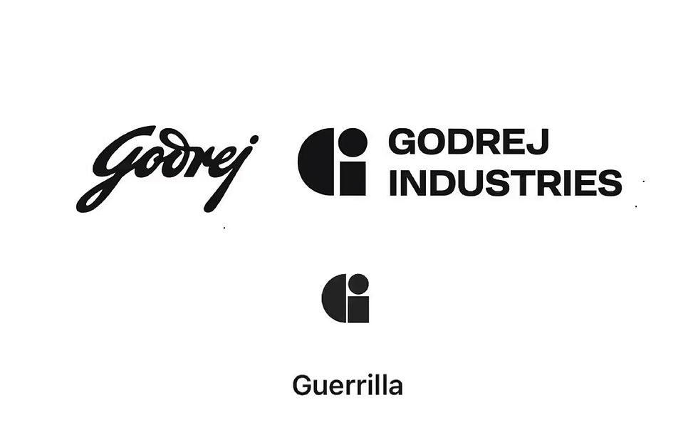
The new "GI" identifier developed by Godrej's in-house design team, Disco, and intended to signal the group's next chapter of growth was being laid side-by-side with the logo of Guerrilla, an independent creative agency based in Australia. The comparisons spread fast. Then came the LinkedIn posts. Then the design community piled on. What was supposed to be a landmark brand moment became a masterclass in how quickly a launch narrative can be hijacked.
But here's what most of the commentary missed: this isn't primarily a story about logo similarity. It's a story about what happens when a legacy brand mistakes modernisation for strategy.
The question worth answering isn't whether Godrej copied anyone. It's this: how does a company with 129 years of brand equity end up in a conversation about borrowed identity?
What Actually Happened ! The Facts, Without the Noise
The rebrand was substantive in scope. The new identity introduced bespoke typography named GI Sans, a proprietary sonic identity, and a signature fragrance, a cohesive multi-sensory brand expression designed to travel across every consumer touchpoint. This was not a logo refresh. This was a full identity architecture project.
Within hours of the Instagram launch, the cracks appeared. Industry observers pointed to visual overlaps in form, typographic treatment, and structural approach not just with Guerrilla, but with iD Fresh and Interdiscount as well. Side-by-side comparisons flooded design and marketing feeds. Virkein Dhar, strategist and partner at Poppy Seed Labs, documented the similarities in detail on LinkedIn and the post did what LinkedIn posts do when they hit a nerve it spread.
Godrej's official response was measured but revealing. The group acknowledged that their IP diligence had uncovered "numerous marks using similar simple geometric compositions." They maintained there was "no ethical or legal impediment" to using the GI identifier and clarified that the GI mark is not a standalone logo but a corporate identifier, intended to appear alongside the Godrej signature or company name.
Legally, they may well be right. Strategically, the acknowledgement raises more questions than it answers.
Three Problems Hidden in Plain Sight
Problem 1: The Minimalism Trap
The design direction Godrej chose, clean, typographic, minimal is the dominant visual language of 2025. It works beautifully on digital platforms. It scales across screens, surfaces, and formats with zero friction. Every major consultancy, every global brand refresh in the last five years has pointed in the same direction.
Which is precisely the problem.
When every brand pursues the same aesthetic logic, the playing field doesn't elevate it flattens. Minimalism without differentiation is not sophistication. It's anonymity with a premium price tag. The reduction to simple geometric forms and clean letterforms means that the visual distance between marks narrows considerably. At that point, the brand identity stops being a distinctive asset and becomes a recognisable category but not a recognisable company.
Distinction is not a design outcome. It is a strategic decision made long before a single pixel is placed on a canvas. When the strategic brief is "look modern," the design team has already lost half the battle.
Problem 2: The In-House Agency Blind Spot
Godrej's in-house design team, Disco, is by all accounts a serious creative operation. In-house agencies have real advantages: speed, institutional knowledge, creative control, and cost efficiency. Bhupal Ramnathkar, Founder and Managing Director of Umbrella Design, identified exactly these three motivators: cost, turnaround times, and creative control.
But here's the structural tension that no one is saying loudly enough: the people closest to the brand are the least equipped to question it.
High-stakes identity work, the kind that resets a brand's trajectory for the next decade demands a specific cognitive posture. It requires the ability to look at a 129-year-old institution and ask genuinely uncomfortable questions. Can you interrogate an organisation you are embedded in? Can you challenge the instincts of leadership when you report to them? Can you hold the creative tension long enough to arrive at something genuinely differentiated, rather than something that feels safe and modern and gets approved quickly?
In-house teams are built for execution excellence. That is valuable. But execution excellence and existential brand questioning are different cognitive jobs. When you ask one team to do both simultaneously you tend to get consensus, not breakthrough. The output looks polished. The thinking is optimised for approval, not impact.
This is what I call the Zombie Studio problem when organisations bring design in-house without transplanting the infrastructure, culture, and independence that allows creative work to function at its highest level. The studio looks like an agency from the outside. From the inside, it has no real power to deliver the kind of work that moves markets.
For a rebrand of this magnitude, the absence of external strategic tension is not a cost saving. It's a risk premium.
Problem 3: Legacy Equity vs. Modernisation The False Trade-Off
Ramnathkar made the observation that deserves to stand on its own: "The original Godrej logo is timeless. The brand history and equity embedded in that logo is valuable. It is so good that it doesn't even need to be refurbished. It's like the Coca-Cola logo."
This is not nostalgia. It's commercial logic.
Brand equity is, at its core, the accumulated cognitive shortcut millions of consumers have already built on your behalf. Every time someone sees the Godrej wordmark and feels trust feels reliability, durability, Indian-ness in the best sense that is an asset on the balance sheet that no line item captures. It took 129 years to build. It cannot be replaced by bespoke typography, however well-crafted.
The modernisation argument is valid. Brands must evolve or they become relics. But modernisation and heritage are not opposites they are complementary forces that the best rebrands learn to hold in tension simultaneously. The Tata identity evolution. Amul's famous continuity. Fevicol's enduring brand character across decades of changing India. These are not brands that chose between past and future. They are brands that understand their past is their competitive advantage.
Godrej had something most brands spend decades trying to build. A mark that carries weight. The question worth asking before the design brief was written is whether the problem being solved was actually a brand problem, or whether it was a business ambition problem being expressed through a visual vocabulary.
This Is Not The First Time: Three Cases That Made History Expensive
Brand identity controversies are not new. What is new is the speed at which social media turns a design comparison into a global conversation before your legal team has finished its morning coffee.
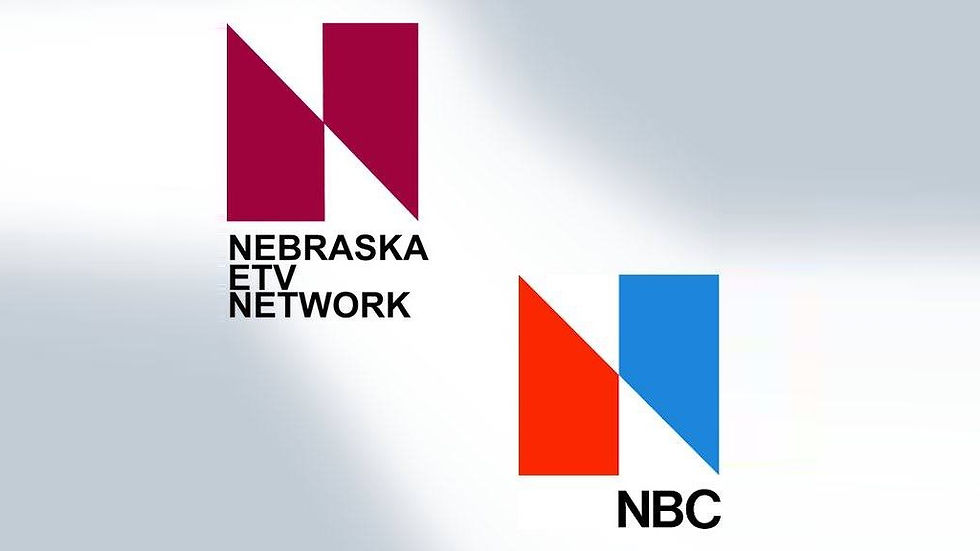
NBC vs. ETV (1970s): The Cost of Skipping Due Diligence
NBC unveiled a new logo that bore a striking resemblance to ETV, a Nebraska public broadcaster. The legal challenge forced NBC to develop a new mark and eventually, they returned to the peacock-based identity that had served them well before. The irony: the original mark they walked away from turned out to be more valuable than the direction they were trying to move toward. Sometimes the right strategic answer is already behind you.
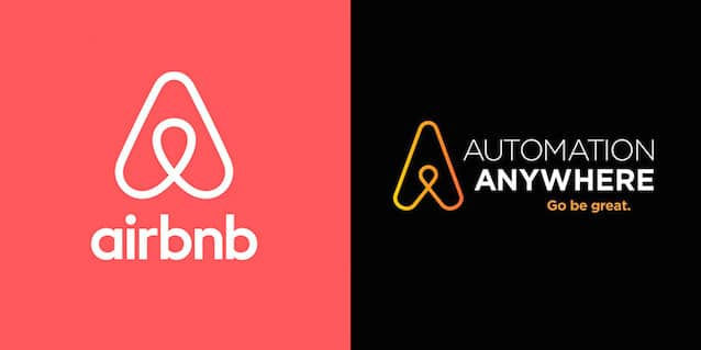
Airbnb vs. Automation Anywhere (2014) : The Simultaneous Convergence Problem
Airbnb's 2014 rebrand of the now-famous "Bélo" mark launched into an immediate controversy when comparisons emerged with Automation Anywhere's logo. Both organisations were pursuing similar design territory simultaneously and independently. Automation Anywhere ultimately transitioned to a new identity. The lesson here is not about negligence, it's about the accelerating convergence of design thinking. In a world where every major agency and in-house team draws from the same pool of references, simultaneously arriving at similar solutions is increasingly probable. The brand that controls the narrative first controls the outcome.

Lidl vs. Tesco (2021–2024) When You Know and Launch Anyway
This is the case that should be required reading in every brand strategy meeting. In 2021, Lidl sued Tesco over their Clubcard Prices logo, both using a yellow circle inside a blue square. The court found internal evidence that Tesco's own team had flagged the similarity during development. They knew. They launched anyway. Tesco lost on appeal in 2024 and now faces an estimated £7.8 million rebrand cost.
The Godrej situation echoes this in a specific way: the group acknowledged discovering "numerous marks using similar simple geometric compositions" through their IP diligence process. The timing of that diligence whether it informed the design direction or followed it is the critical question. Because discovering similarity after you have committed to a direction and discovering it before are two entirely different strategic positions.
The Real Cost: And It Is Not Primarily Legal
There will be commentary about redesign exposure and trademark risk. That is legitimate. But the more significant cost in the Godrej situation is one that appears nowhere on the balance sheet.
Godrej Industries had simultaneously announced an ambition to reach a combined market capitalisation of ₹5,00,000 crore by 2031 with targets of over 15% annual sales growth. The rebrand was the brand signal for that ambition. It was supposed to say: we are entering our next era. It was supposed to generate earned media that celebrated vision and forward momentum.
Instead, the dominant conversation became about oversight and originality.
A rebrand is a company's largest earned media moment. You cannot buy the kind of attention a major identity launch generates. It touches press, social, industry commentary, consumer sentiment simultaneously, at scale. When you control the narrative, that moment is an extraordinary strategic asset. When you lose the narrative even to a controversy that turns out to be legally manageable you have spent that asset and received nothing in return.
The question is not whether Godrej will recover. Of course they will. The question is whether the launch delivered what a launch of this scale and investment was supposed to deliver. And the answer, by any honest measure, is no.
The Brand Architect's Checklist: What Should Have Happened
For every brand leader, CMO, and founder reading this as they approach their own identity work:
1. Run the heritage audit before a single pixel is placed. What does your brand already own in your customer's mind? What associations, memories, and trust signals are embedded in your existing identity? Map that equity explicitly. Design against it, not away from it.
2. Commission external creative tension for existential identity decisions. In-house teams are built for execution. High-stakes identity work requires the kind of outsider objectivity that cannot be manufactured internally. The discomfort an external partner brings to the brief is not a problem it is the work.
3. Run global trademark and visual similarity searches before you are attached to a direction. The moment your team falls in love with a mark is the moment your objectivity around its risks disappears. Similarity searches must happen upstream, when you can still change course without political cost.
4. Define the idea before you define the visual. Differentiation is not a design exercise. It is a strategic one. What is the idea the mark is expressing? If the answer is "modern" or "clean" or "contemporary," you do not have an idea you have an aesthetic preference. That is not enough to protect a brand.
5. Test the mark with your actual audiences, not your internal stakeholders. Internal approval processes are optimised for consensus. Consumer reality is not a consensus. The gap between what a leadership team loves and what a customer reads can be significant and it will show up in the market, not in the boardroom.
6. Plan for the social media court because it convenes faster than any other. In 2025, public opinion moves at a speed that legal timelines cannot match. Your crisis communication posture for a launch controversy should be planned before launch, not drafted in response to a LinkedIn post at 11pm on launch day.
The Closing Thought
Here is what the Godrej situation ultimately reveals not about Godrej specifically, but about the moment legacy brands find themselves in.
There is enormous pressure on established Indian brands to look global. To shed the aesthetic weight of their heritage and arrive looking sleek, minimal, and contemporary. That pressure is understandable. India's corporate landscape is maturing rapidly, capital markets are demanding premium positioning, and the design zeitgeist rewards clean visual thinking.
But the brands that will define the next decade of Indian business are not the ones that successfully erased where they came from. They are the ones that figured out how to make where they came from the most compelling part of where they are going.
Godrej didn't just face a design controversy. They surfaced a deeper truth that for legacy brands, the real risk isn't looking old. It's looking borrowed.
The world's most trusted brands are not remembered for how minimal they became. They are remembered for how unmistakably themselves they stayed.


Comments